The standard non-alc brand identity goes one direction: calmer, and overt about moderation. Botivo went the other way. One year after its launch, the U.K. aperitivo brand replaced a visual identity its founders described as “pleasant but quiet” with one built around extroversion, food culture, and the pleasure of the drink itself. The sales data has since arrived. According to BevNET, citing Circana value-sales tracking of no-and-low spirits across all retail outlets for the 52 weeks to June 13, 2026, Botivo is up 408% year over year, in a window that also brought a supermarket exclusive and a canned format.
What triggered the rebrand, and what preceded it
Botivo wasn’t failing when co-founder Imme Ermgassen started the rebrand. The liquid was winning awards, and the founders wanted an iconic brand rather than a beautiful product.
Three problems surfaced. The liquid was bold and bittersweet while the brand language was calm and craft-led. Early communication leaned on ingredients and process, which explains a product without creating attachment. And the wine-style bottle read as a ready-to-serve rather than a mixable aperitivo, and failed what the team called the five-meter test: it didn’t command attention from five meters away on a bar back or a supermarket shelf.
The team ran social listening, focus groups, and conversations with enthusiasts before briefing a designer. The finding, per the company: people drawn to Botivo were motivated by pleasure, not restraint. They cared about food culture, ingredients, craft, and the rituals of drinking and dining. They simply weren’t seeking something virtuous. Positioning followed the finding: the intersection of craft and pleasure, with flavor and sensory experience in front and moderation absent from the message.
What stayed vs. what changed
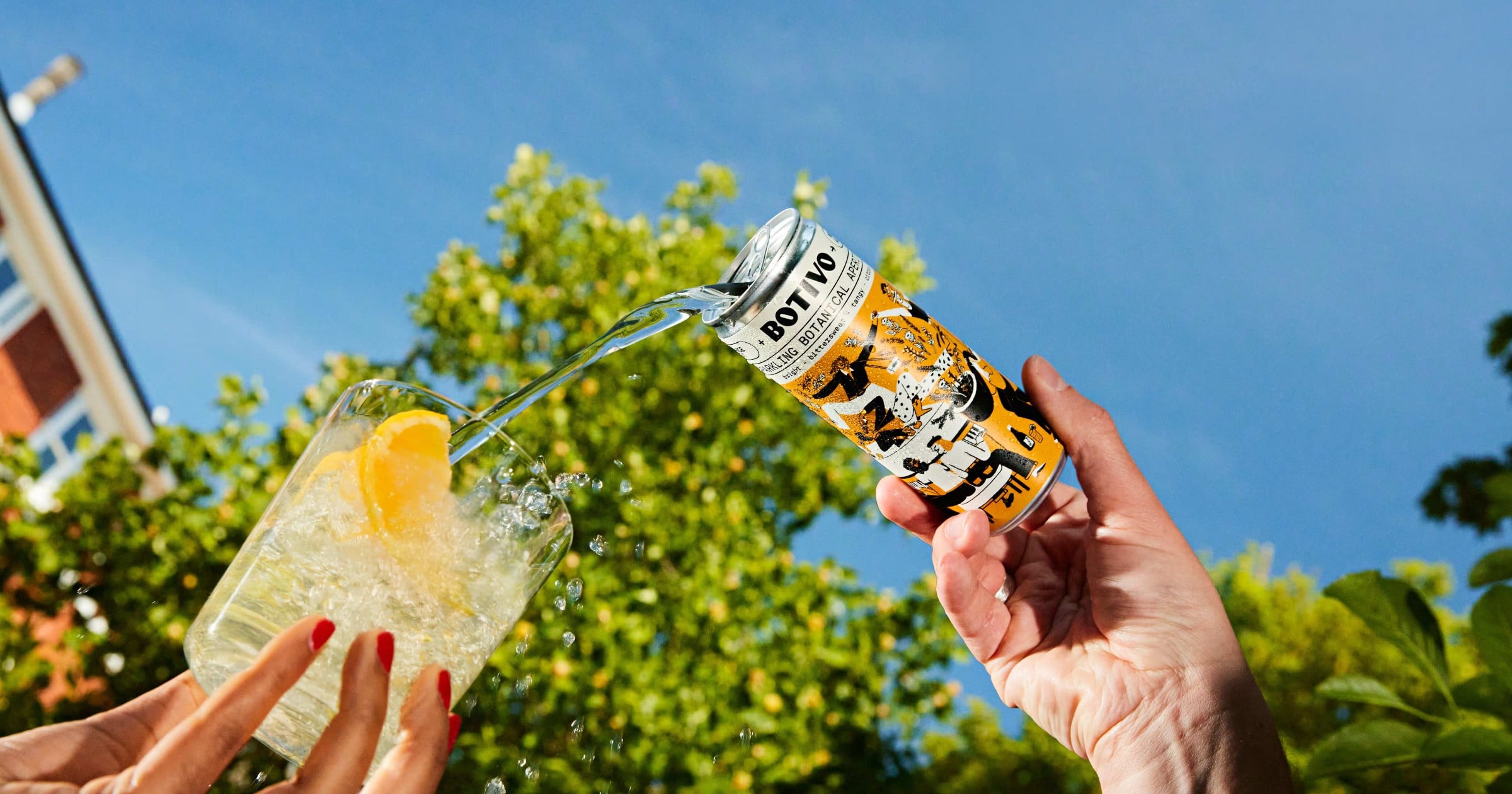
Botivo kept the wax top and made its yellow the defining brand color. It changed the bottle format entirely. Illustrator Rozalina Burkova built a character-filled brand world set in contemporary London, mixed ages around a table, designed to expand. Beach Studio refined label, typography, and site. One year after the visual rebrand, the tone of voice was reworked with strategist Darius Rodrigues, the tagline moved from “Slow-Sipping Botanicals” to “Big-Sipping Botanical Aperitivo” (the company site today leads with “The Big-Sipping Botanical Non-Alcoholic Aperitif”). The back label was rebuilt around mixing guidance and serve rituals.
The commercial expression of that brand world has widened since. In January 2026, Waitrose took a Botivo x Ottolenghi limited edition as a supermarket exclusive. The company shop now lists a 250ml canned spritz, the signature serve pre-mixed, alongside the bottle. And in July the brand pitched hedonism to the bar trade at Tales of the Cocktail in New Orleans, per BevNET, an audience most non-alc brands do not address in those terms.
The takeaway for American brands
The U.K. aperitivo occasion is further along than its U.S. equivalent. The research approach still transfers. Botivo asked who was already buying, found that those people were motivated by pleasure rather than restraint, and took moderation out of the brand message on that evidence. Many American non-alc brands make the opposite call, often for a distribution reason rather than a positioning one: the absence is the search term, the shelf cue, and the reason a category buyer grants the set a facing. A brand that strips “non-alcoholic” off the front label in a U.S. grocery aisle can lose the shopper who came looking for that exact word.
The trade-off between discoverability and resonance is real, and Botivo sidestepped it. The packaging leads with hedonism and the company’s own site leads with “The Big-Sipping Botanical Non-Alcoholic Aperitif.” The two cues went on different surfaces.